
Posted on

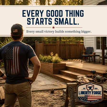
Every Good Thing Starts Small

Liberty Forge Built graphic showing hands at work on a small project, with the line Every good thing starts small.

Every good thing starts small.

That is easy to forget because finished things get most of the attention. Finished products. Finished rooms. Finished collections. Finished businesses that look, from the outside, like they arrived all at once.

They did not.

They were built through small decisions that nobody clapped for at the time. A better line of copy. A cleaner mark. A corrected mistake. A product description rewritten because the first version was thin. A category fixed. A policy page added. A design rejected because it looked good for five seconds and wrong after ten.

Small work is still work.

Sometimes it is the work that matters most.

Small Victories Are Not Small

A small victory is easy to dismiss because it does not feel dramatic.

Fixing the deck board. Finishing the listing. Teaching a kid how to hold the tool safely. Sending the email. Cleaning up the menu. Writing the first draft. Making the page easier to read. These are not the kinds of things people usually build a story around.

But they are how bigger things get built.

The useful question is not whether a task looks important from far away. The useful question is whether it moves the work forward. If it does, then it counts. A business is not built only by large launches. A family is not strengthened only by big speeches. A home is not maintained only by major renovations.

The same is true for a brand.

Every small correction either clarifies the direction or lets confusion stay in place. Enough clear decisions in a row begin to look like identity.

Building Requires Restraint

One of the harder parts of building Liberty Forge Built is deciding what not to use.

There is always another font that looks tough. Another texture that feels patriotic. Another badge, flag, stripe, star, or slogan that can be added to a design. The temptation is to prove the idea by loading it with evidence.

That usually weakens it.

A strong mark does not need to shout every possible meaning at once. It needs to carry one idea clearly. The same is true for a product page, a homepage section, a blog post, or a collection. If everything is emphasized, nothing is.

Restraint is not emptiness.

It is discipline.

It is the decision to leave room for the customer to understand the thing without being pushed around by it. Clean design, plain writing, and simple structure are not lesser versions of the work. They are often the result of taking the work seriously enough to remove what does not belong.

What We Are Actually Building

Liberty Forge Built is not trying to become a store full of random patriotic graphics.

That would be easy to make and hard to care about.

The better goal is identity collections. Backyard Operations for the people who know how to turn a Saturday into a gathering, a project, or both. The Watch Never Ends for the people who answer the call in military, fire, police, EMS, dispatch, and other service roles. American Heritage for the values, places, stories, and responsibility that connect to the road to America 250. Brotherhood for the people who know belonging is built through shared work, shared humor, and showing up.

Those collections need products, but products alone are not enough.

They need a point of view.

That is why the blog matters. That is why campaign content gets turned into stories. That is why product descriptions need to be stronger than keyword filler. Every piece should help a visitor understand what Liberty Forge Built believes, who it is for, and why the designs exist.

The brand is being built in public, one clear decision at a time.

Small Business Is Mostly Repetition

There is a romantic version of small business that focuses on the launch moment.

The real version is more repetitive.

Check the product feed. Fix the missing attribute. Rewrite the description. Test the checkout. Repair the integration. Add the policy page. Create the next post. Make the next image. Review the analytics. Try again when the platform flags something that worked yesterday.

That work can feel invisible, but it is not wasted.

Trust is built through repetition. Customers may never know which plugin was removed, which product field was fixed, or which page was rebuilt so it loaded cleaner. They will only feel that the site works, the brand makes sense, the policies are visible, and the content has substance.

That is enough.

A good brand does not need every customer to see every piece of work behind it. It needs the work to hold together when they arrive.

Keep Building What Holds

The question behind every small victory is simple.

Does this hold?

Does the design still work when the trend fades? Does the article give value to someone who never buys? Does the collection make sense without a long explanation? Does the product fit the life we are talking about? Does the brand look like it belongs to itself?

Those questions are not glamorous. They are useful.

Liberty Forge Built will keep answering them through the Liberty Forge Built collection, the Freedom 250 collection, and the stories that give those products context.

Every good thing starts small.

Then it has to be built again tomorrow.

Posted on

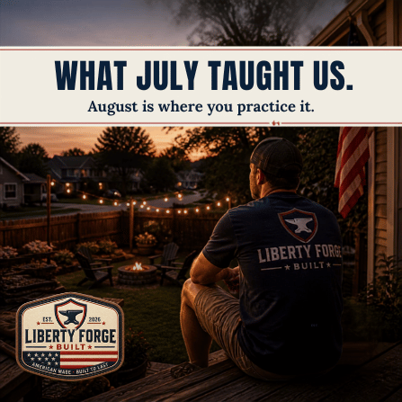
What July Taught Us

Liberty Forge Built reflective summer graphic for What July Taught Us, with warm light and clean navy typography.

July taught us something about time.

Not because July was perfect. It never is. The month has heat, noise, travel, work, expenses, plans that change, and days that disappear faster than they should.

That is part of the lesson.

Time does not become meaningful because the calendar is easy. It becomes meaningful because we choose what to do with it while life is still crowded, imperfect, and moving.

The Time to Make It Count campaign was built around that simple idea. Summer is not something that happens to you. It is something you do.

July gave us the first test.

August is where we carry it forward.

Time Has to Be Made

July makes one thing obvious if you are paying attention.

Time does not open itself.

There is always a reason to postpone the gathering, delay the project, skip the call, or assume there will be a better weekend later. Sometimes there is. Sometimes there is not. The habit of waiting can make a full month feel strangely empty by the time it is over.

Making time is not the same as having extra time.

Most people do not have extra time lying around. They have time that has to be chosen away from something else. That choice can be small. An hour outside after dinner. One evening with the phone down. One Saturday morning spent finishing the thing you said you would finish. One invitation sent before you talk yourself out of hosting.

July taught that the choice is usually smaller and more available than it feels.

That is a useful lesson for any season, but summer makes it easier to see. The daylight lasts longer. The yard is more useful. People are a little more willing to gather without a formal reason. Those conditions will not stay forever, which is exactly why they should not be wasted while they are here.

Presence Changes the Weight of a Day

Being present does not add hours to the day.

It changes what the hours are worth.

That is why one ordinary evening can stay with you longer than an expensive event you barely remember. The difference is attention. When people are actually there, conversation deepens. Small jokes become family language. A simple meal becomes a marker. A project becomes a memory because somebody learned something while doing it.

July offered plenty of those chances.

Some were probably missed. That is normal. Some were probably taken without anyone recognizing them at the time. That is normal too.

The point is not to grade the month.

The point is to notice what presence did when it happened, then build more of it into August.

Presence also reveals what does not need to be carried forward. Some habits look normal until a quiet evening shows how much they have been stealing. Some obligations are real, and some are only reflex. July has a way of sorting those things if we are willing to pay attention.

Small Victories Add Up

A campaign about making time count cannot only be about rest.

Rest matters, but so does building.

July reminded us that a life is often shaped by small victories. The deck board fixed. The conversation had. The child taught. The room cleaned. The product launched. The story written. The first step taken on something that had been waiting too long.

Those victories can look unimpressive from the outside.

They are not.

They create momentum. They prove that effort still works. They give the next day a little more structure. They turn a vague intention into something visible. A family, a home, a business, and a brand are all built that way, through repeated decisions that would be easy to dismiss if you looked at them one at a time.

Liberty Forge Built is being built the same way.

One collection. One story. One corrected page. One cleaner design. One better explanation of what the brand is for.

That is not a side note. It is the whole operating method. A brand that wants to talk about heritage, service, work, and responsibility has to be built with the same patience it praises. The small work has to match the message.

What We Pass Down Is Practiced First

July also brought the generational question back into focus.

What are we passing down?

It is easy to answer that with big words. Freedom. Responsibility. Service. Heritage. Country. Family. Craft.

But those things are not passed down by naming them once. They are passed down by practicing them where younger people can see. A child learns responsibility by watching someone keep a promise. They learn service by watching someone help without making a performance of it. They learn craftsmanship by seeing a job done carefully when nobody would have noticed a shortcut.

America 250 makes that question larger, but it does not make it distant.

The country is not only carried forward by institutions. It is carried forward by families, trades, towns, churches, teams, volunteer departments, shops, farms, and neighbors who keep practicing what matters.

July did not answer the question for us.

It reminded us to ask it.

That reminder is valuable because it keeps the America 250 conversation close to real life. A national anniversary can feel distant if it stays in official language. It becomes more useful when it sends people back to the table, the garage, the local landmark, the family story, and the work still waiting in front of them.

Still More Coming

The first week of August is not an ending.

Summer is still here. The lessons still apply. The days still need to be chosen. The people still need to be gathered. The work still needs doing. The story still has room.

That is the point of carrying July forward.

Not nostalgia. Not regret. Practice.

Liberty Forge Built will keep building stories and apparel around that practice, from the Freedom 250 collection to the Liberty Forge Built collection.

July taught us how to make time count.

August is where we prove we learned it.

Posted on

Every Mark Should Mean Something

Navy Liberty Forge Built graphic reading "Every mark should mean something." above the anvil badge logo.

A design does not start with artwork. It starts with a question.

Before anyone at Liberty Forge draws a compass, sets a headline, or picks a ribbon shape, the design has to answer one thing: what does this say about the person wearing it? Not what does it look like. What does it mean. If the answer is not clear, the design does not move forward, no matter how good the sketch looks.

That sounds like a small rule. In practice, it is the rule that decides almost everything else.

The Question Comes First

Liberty Forge is built around four collections, and each one exists to answer a different question about the person wearing the shirt. Backyard Operations answers what do I do on Saturdays. The Watch Never Ends answers what do I do for a living, and it speaks to military, fire, police, EMS, and dispatch. American Heritage answers what do I believe. Brotherhood answers who are my people.

Every design has to land in one of those four questions before it earns a single line of artwork.

This is a checkpoint, not a suggestion. If a concept cannot be placed into a collection and connected to that collection’s question, it does not have a Liberty Forge identity yet. It is just an idea. Ideas are cheap. A design that knows what it is standing for is not.

Working this way keeps the catalog from turning into a pile of unrelated one-liners. It also keeps the team honest. It is much easier to catch a weak concept when the test is specific: does this answer one of four questions, clearly, or not.

What Gets Rejected

Most concepts that get rejected fail in one of a few predictable ways.

A design that is only a slogan gets rejected. Words on a shirt are not the same thing as an identity. If the concept is a phrase with no symbol carrying it and no collection behind it, it reads as novelty, not heritage. Liberty Forge is not a novelty T-shirt brand, and a slogan alone cannot answer what do I believe or who are my people.

A design that could belong to any brand gets rejected. If the concept would look just as at home on a generic flag shirt from a big-box rack, it is not doing its job. The identity collection framework exists specifically to prevent this. A design tied to a real question about the wearer cannot be generic, because generic designs do not answer anything.

A design that crowds the space gets rejected. Liberty Forge artwork is built on bold, clean linework and generous negative space, and that space is not empty by accident. It is what makes a design readable at a glance, whether someone is looking at a shirt across a room or a thumbnail on a phone. A composition that packs in extra flourishes, extra text, and extra symbols to fill the canvas usually means the core idea was not strong enough to stand alone.

A design that leans on distress texture to fake age gets rejected. Cracked ink effects and scuffed edges are an easy way to suggest heritage without earning it. Liberty Forge is premium Americana, not distressed clutter. If a design needs artificial wear to feel authentic, the authenticity was never really there.

One Dominant Symbol, Not Five Small Ones

The designs that survive this process share a structure. One dominant visual symbol carries the identity: a compass, a shield, a watch, a tool, a figure. Everything else in the composition supports that symbol instead of competing with it.

This is harder than it sounds. The instinct when building apparel graphics is to add more, because more can feel like more value. A second badge. An extra ribbon. A background pattern. But a shirt is read in about a second, whether it is on a store shelf, an Etsy thumbnail, or someone walking past you at a gas station. A design with one clear symbol reads instantly. A design with five competing symbols reads as noise, and noise gets scrolled past.

The Liberty Forge shield shows up across the catalog as a framing device, and the compass and forge motifs appear the same way, used subtly rather than stamped on everything. They support recognition. They are not the point of the design. The point is always the identity underneath them.

What Actually Survives on a Shirt

Screen appeal and print performance are not the same thing, and this is where a lot of otherwise good ideas fall apart.

A gradient looks great on a laptop screen and turns muddy on a screen-printed shirt. A fine hairline detail that reads crisp at full resolution disappears the moment it gets printed small on a sleeve. Photographic realism, glowing effects, and soft shadows all depend on subtlety that apparel printing cannot reliably reproduce, especially on dark fabric.

What holds up is what the brand actually uses: bold silhouettes, strong separation between colors, and a restrained heritage palette built for screen printing and direct-to-garment work. Antique cream, charcoal, faded navy, deep burgundy. Colors that stay distinct from each other instead of blending into a smear at production size.

Typography follows the same logic. Avenir Next carries headlines because it stays legible at a distance. Inter carries body copy and captions because it holds up clean at small sizes. Neither font needs decoration to do its job, which is the whole point.

The test we come back to is simple: if it does not survive on a dark shirt at storefront-thumbnail size, it is not finished. A design that only works as a screen mockup is not a Liberty Forge design yet.

Restraint Is the Standard, Not the Compromise

None of this is about limiting creativity. It is about making sure creativity serves the identity instead of covering for a weak one.

A brand that lets every idea through eventually stands for nothing in particular, because nothing had to earn its place. Liberty Forge would rather finish one design that clearly answers what do I believe or who are my people than release five that look busy and mean little. That is why the identity question comes first, why the negative space stays generous, and why distress texture does not get to do the work that a real symbol should be doing.

This is a small brand, run by people who care whether the mark on a shirt actually means something to the person wearing it. That is a modest goal. It is also the whole standard.

If you want to see what that standard looks like in finished work, the American Heritage collection and the Freedom 250 designs are built on exactly this process. You can read more about how the brand thinks about the year ahead in America 250 Is a Year, Not a Day, and the full catalog is also available through Liberty Forge Built on Etsy.